Wednesday, March 28, 2018

Milk Bath pictures

Here are my favorite pictures from our shoot.

The milk looked kind of weary so I figured I could put a filter and increase the exposure to make it look more white and less diluted. Majority of the pictures that I chose had my cousin “looking” up or straight. I remember during class that my teacher pointed out very successful magazine covers and all of them had the model staring directly at the consumer, which I believe helps create a better connection between the product and customer. From this article, Laura Sherman gathers her pick on the best magazine covers within half of the decade, one thing they all have in common is their eye contact, staring directly straight, where their eyes can easily meet with the consumer on the shelf.

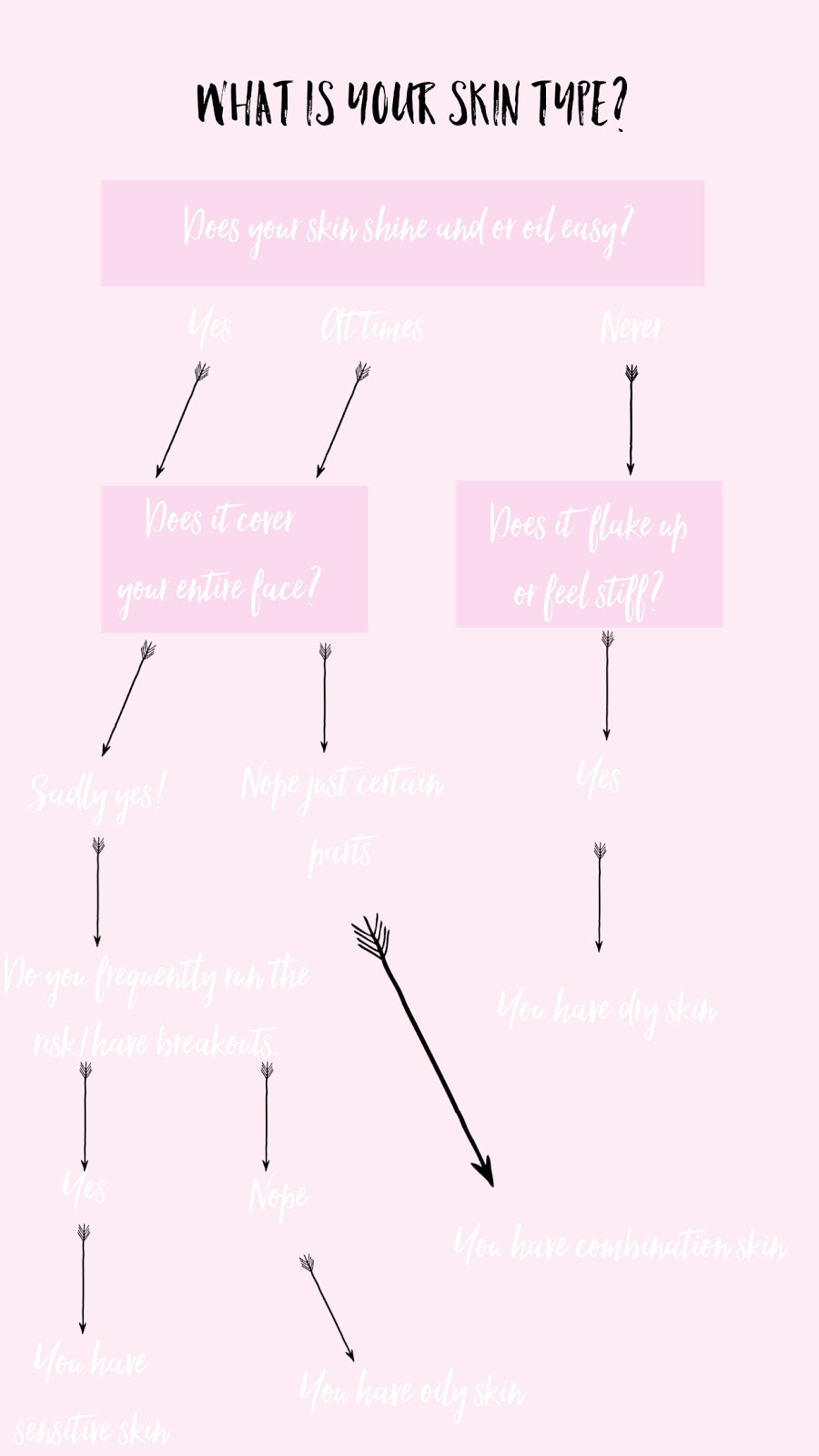
I've been using this app called over and vsco. Over is really good at helping me collect the right colors for fonts and different effects for my pictures. I used over for my skin care quiz as well. So far I have the edited picture that I'm going to use for my cover. I increased exposure and used warmer tones, since it is a near summer edition and I decided on the month of May.

I photoshopped my cousins body just a little because no matter how much we say that we prefer natural bodies, it's still the slimmer models who take up the majority of the runway. I also made her skin smoother and the body suite brighter and evenly toned.


Monday, March 26, 2018

Finally making my milk bath!

Hi so my cousin finally came over to help me with my project! There was a delay with my flowers so I was able to cancel the order. In retrospect it probably would've been easier to grab a bouquet of flowers from Publix but I was just being cheap.

My cousin and I went around my yard and the neighborhood picking the prettiest flowers. We decided to choose the flowers that were super vibrant and could stand out. Her outfit that I chose was a bodysuit that I bought from Forever 21 impulsively and never wore, but I knew that I kept it in the corner for a reason!

Not going to lie when I was pouring the milk out into my moms bathtub I thought that I was going to collapse and die. I completely forgot that my parent’s bathtub had dye which was wearing off. It got into the milk but it was okay because it didn't show up in the pictures. My iPhone 7 didn't do that bad of a job with capturing the moment and I'm super happy that my cousin got into a bath of dirty milk for me and was getting neck cramps the whole time all for my grade, she's honestly the best! I'll attach my favorite pictures in a post later but here's a video of me and her in the process, hope you enjoy.


Sunday, March 25, 2018

Final Decisions/Time management

My cousin is coming on Tuesday, so right after my practice we can shoot the milk bath picture. I had some doubts about making it plain white, but I didn't want for the picture to be overwhelming and look tacky, which would take away from the fact that I wanted something simple.

I also think that I'm going to go to the beach Sunday. For the face mask part that I'm going to use on the models, I'm going to gather some of my old face mask, put water color on the mask and gather some containers and decorate them. FYI any information that you get from the chart, you should not take from me because I am not a licensed/studying to be dermatologist or esthetician, even though I would love to be one day!

Wednesday, March 21, 2018

Double Page Spread

Hi everyone! I forgot to mention in my last post that Sophia and I decided that my magazine should be released around end of spring/beginning of summer. I've observed a pattern in my peers and I throughout these past few years. We always want to get “summer ready” which means taking care of our bodies for that short period of time so we can look good at the beach or for vacation pictures, so skincare is included in that category.

Regarding the double page spread, I actually want for the models to look a little more homey and fun compared to the picture that I previously posted(link post with it)  as a base for what I wanted to accomplish. A magazine is fun and quirky, also I didn't want for both of my pictures to be completely serious. In addition, our main goal is to target teenagers, and it’s important that we have our audiences attention, (since the attention span of the average American has seen a serious decrease) with more than pictures, which is where the quiz comes into place.

Here's the inspiration for the quiz that I made to put next to the picture! My friend literally volunteered herself to be in the spread, so now all I need is two more volunteers.


Monday, March 19, 2018

Milk Bath

Starting off, I'm so glad that it's spring break! Literally so happy that I made it past this quarter with only As and Bs. I think that spring break will help me catch myself and get back to being organized like second quarter even though I have a ton of extra curricular activities, but anyways, this blog post is supposed to be about my project.

So I began to work on the cover page of my picture, and I think it'll come out really well. First I need for all of my items that I ordered to finish shipping and find a model that would be a good fit for this cover page. I just really love these type of pictures. The highkey lighting and the white surrounding the model gives her sort of a pure and simple look, along with her smooth features. So we want a model as well who has features that sort of contrast the white and petals but at the same time doesn’t draw too much attention from the background. How I'm gonna do it is fill my bathtub with milk, water, acrylic paint, real and or fake flowers, just to test which ones stand out against the milk. I'm super excited to do this! I'll probably use my cousin but she can't swim so I hope she won't think she's drowning.

Usually milk bath pictures are for maternity or newborn pictures but I think that we can redefine that connotation.

I think I'm going to try and shoot my picture for double page spread this weekend with a few friends. My cousin from New Jersey is coming, my mom said, hopefully he can drive me but he’ll probably be spring breaking it up at Ultra or one of those festivals. Let's keep our fingers crossed that he’ll come through for me.

Sunday, March 18, 2018

Double Page Spread final decision

So I decided what I am going to mainly focus on for my double page spread; the face mask.

One magazine I really look to as an inspiration for my project is allure magazine. I was thinking that my double page spread should be an ad and sort of an interactive page that readers can really indulge in, as we are teens and still have hope in the fact that large companies still care about our needs.

So here is the magazine cover from Allure that I want to tweak sort of and make my own.


 I love the fact that the girls are natural and the calming neutral clothing doesn’t distract from the main focus of the headline; The Beauty of Diversity. So I think my models will be in very relaxed clothing. Also, I want for my models to be a little bit closer together like so:
 
Yes, I know that I cannot draw, but its merely an outline and I promise that the picture will come out better.

 Also for the quiz portion I wanted to make in informal and simple, as we are targeting teens. I won’t copy the chart verbatim but, I will add my own words and different advice on which skin type the person my have, (which should not be taken from me obviously).


Thursday, March 15, 2018

Double Page Spread

I had two options for our double page spread. One is an interview with a fake celebrity and another is a face mask ad, and next to that is a quiz on what face mask you should buy.

I saw a few face mask advertisements online. A lot of them show to be dealing with colors associated with nature, such ass green and blue. I think that this ties back to the sort of natural movement I’ve seen. A few post ago, my research noted how the skincare industry has seen an extreme increase in sales, and since our issue is around summer time, that’s when people are more likely to start taking care of their bodies, to get “vacation ready”.

For my interview with a fake celebrity I was going to reach out to one of my friends who do makeup or play sports. I chose makeup because the sad truth is, according to Huffington Post and PR Newswire, almost half of the female population feels unnattractive without makeup, almost 60% wear it on a regular basis, and 25% started to wear it at the age of 13. I know, it’s bad to feel off of people’s insecurities, but anything to get our magazine bought.

I think I will try both campaigns this week and pick whichever one looks best to me.

Down below I’ve listed some examples of how I would like for my magazine spread to look.


Citations: Misener, J. (2012, February 28). Half Of Women Are Dependent On Makeup, Study Says. Retrieved March 19, 2018, from https://www.huffingtonpost.com/2012/02/28/half-women-need-makeup_n_1306202.html 
Renfrew Center Foundation. (2013, February 21). From Barbies To Blush - New Survey Reveals Young Girls Are Wearing Makeup Earlier Than Ever To Hide Their Insecurities. Retrieved March 19, 2018, from https://www.prnewswire.com/news-releases/from-barbies-to-blush---new-survey-reveals-young-girls-are-wearing-makeup-earlier-than-ever-to-hide-their-insecurities-192318071.html


Monday, March 12, 2018

Table of contents

So I’ve been glancing at a few magazine table of contents and no matter what genre or demographic that the magazine is targeting, the designs usually have a few connections.

I’ve noticed that magazine font color usually correspond with the outstanding colors in pictures surrounding them. For example, Vogue’s February of 2010 issue features a woman dressed in black and white just like their font. Another good table of contents is Food Networks table of contents. On the page there’s a sandwich, with a few red and orange colors inside, then the fonts are in the same color scheme. The pictures of what I was referencing will be displayed down below.

When it comes to figuring out where headlines should lie, I found a blog post, from a girl doing the same project as me. I noted that important headlines should be around images, most likely because that’s where the reader’s eye will be drawn towards. Also the subjects in our table of contents should obviously relate to the content being featured in our magazine and the masthead should be repeated in the magazine.

I also played around with an app to make a mock table of contents.

 
Citations:  Wallace, A. (2018). Magazine contents page analysis 1. [online] Amywallacemedia.files.wordpress.com. Available at: https://amywallacemedia.files.wordpress.com/2012/09/magazine-contents-page-analysis-1.jpg [Accessed 19 Mar. 2018].


Sunday, March 11, 2018

Pictures finally!!


Unfortunately, Sofia was sick so we had to take a rain check on the shoot. That’s all fine because we have this and the week after to shoot, until we really have to crunch in, her health is more important. Besides that, I’ve been thinking it over and my week sailed a little bit more smoothly when I made my agenda, which inspired me to make it regularly. But without further a due, here are the pictures as promised.


Here’s a little something that I made with canva, really just my name over some pancakes  but I’ll get better at using the name sooner or later.

Next I have some color schemes that I mentioned in my first post but I don’t think that it was uploaded properly. Then, right after the color schemes we have a psychology of color chart to help explain why we may choose certain colors in our magazine.


Citations: Mr. Clean Magic Erasers: Creative Uses For These Household Cleaning Blocks That Truly Work Magic! (n.d.). Retrieved March 11, 2018, from https://pin.it/tzss5gwmtz6y63


Teal Blue Color Palette Schemes Hgtv Purple Orange Scheme For Bathrooms We Yellow And Turquoise Red Green Website Kitchen Burnt Wedding Living Room With Generator Weddings Pinterest. (n.d.). Retrieved March 11, 2018, from http://hsbstore.com/orange-color-scheme/teal-blue-color-palette-schemes-hgtv-purple-orange-scheme-for-bathrooms-we/

F. (2018, February 27). Blue and lemon color scheme. Retrieved March 11, 2018, from http://www.fabmood.com/inspiration/blue-lemon-color-scheme/

Thursday, March 8, 2018

Uncertainty

So I was thinking about what our ad should be. Maybe I should make it about something natural, since our magazine is trying to give off that certain vibe. Maybe a face mask, hair products or clothing items. I see a lot of people have been really getting into face mask. I can simply walk into a store and the whole section will be sold out. Skincare sales have increased by more than 50 percent for many companies. So considering that fact, it is an ad that our consumers will most likely like to see because along with sales, searches involving face mask have increased by over an average of 2,000 percent within the past two years.

Also, I found my magazines and have some examples for how I would like for my magazine’s table of contents to be presented. I’ve been playing around with this app called canva as well, which possibly can help with the creation of our cover page.

Sofia and I are still unsure of what we want for our cover pages to be, but we’re still super excited to shoot with Robin, but we did move our shoot to Sunday because of our busy schedules.

As of this moment my iPad is completely spazzing out and Blogger only can access half of my camera roll and none of my recent photos on google drive so for now until I get the problem fixed my images will have to be linked :(

Hopefully next time I log on the problem can be fixed, so get ready for a tsunami of pictures guys!


Citations:* All products require an annual contract.    Prices do not include sales tax    (New York residents only). (n.d.). Top U.S. face mask product searches 2016 | Statistic. Retrieved March 11, 2018, from https://www.statista.com/statistics/683800/us-growth-face-masks-beauty-online-search-queries/ 

Tutton, R., & Collins, A. (2016, April 27). Millennials Disrupt Beauty Industrys Antiwrinkle Agenda. Retrieved March 11, 2018, from http://wwd.com/beauty-industry-news/skin-care/millennial-beauty-antiwrinkle-baby-boomer-10419202/ 
Stats on increase in earnings for the skincare industry.
Help show that people have an increase in interest for face mask

Monday, March 5, 2018

Learning to Perfect my Craft


It’s me again! So I just took the time to create a schedule that I will link right here. Sofia and I started to choose some names for our magazine. Since we are a fashion based magazine we looked at makeup and clothing websites for inspiration for our clothing. 

Also, in class Sofia and I looked and noted that in fashion magazines, usually there is an ad right before the table of contents. Also table of contents include sections that are regulars, like a diet or a hot or not section. I left my magazines at track practice so next post hopefully I can give examples of what I would like for my table of contents to look like. 


Sunday, March 4, 2018

Management

So guys I am here last minute, once again, crunching my time into my third post for the week. Next week I plan to manage my schedule a little bit better with sports, academics and other extra curricular activities.

Next week I plan to explore the blogger a little more day by day and get to know its features better. Also, so I’m not trying to submit my blog post frantically at 11:59 pm, I am probably going to do it while helping my neighbor with her homework which is Mondays, Tuesdays and Thursdays, then fitting in a fourth post on Sundays.

As far as shooting goes Sofia and I plan to meet up with Robin, her modeling agent sometime soon on the weekends. I think that this weekend would be best since I don’t have a volleyball tournament or a track invitational this weekend. But first we have to decide on what type of shoot we would like to do as far as the theme and the models that we need.

Yesterday I received some wise words from a few kids at a volunteering event. At the volunteering event that I had went to last week at a foster care home I ask some girls for magazine ideas. One girl named Rachel, who appeared to be around my age, said she wanted to see girls dressing more “realistically” she said. Less girls “... in pillow fights with perfectly straight hair and matching pijama sets”. Rachel’s friend from across the table added, “No one believes that shit is real.” To be quite fair I completely agree with the fact that our magazines need to have a more natural approach instead of making girls look so clean cut.

I went around asking for the opinion of girls who looked around twelve to sixteen on what they would like to see more in magazines. “¿Cómo pueden las revistas ser mejores?”  Asked this girl in very broken Spanish, how can our magazines be better? She simply replied with “Menos blanquitos y chicas flacas.” It took me a fat minute to register what she said but it then cliqued; less whites and skinny girls. Which, less often then usual, is a lot of what is seen in the magazines. So I will take note of what this girl said and include diversity in my magazine and ask other girls at my school what should be more in teenage fashion magazines.


Saturday, March 3, 2018

Different Elements

Hi guys!

So my partner and have decided that we were going to do. Fashion magazine. Even though it doesn’t earn as much as lifestyle, it is a topic that we do enjoy.

Along with researching magazine genres, other elements need to be discussed. Some important elements of the magazine include color scheme, table of contents, models included and the certain “vibe” we want for our magazine to give off.

Colors usually help people judge a certain being or object. We associate red usually with anger and violence, light blue with serenity or calmness, green with envy or greed and etc. Peter D. Marshall, a film directing coach, adds that using color, “... can help add new visual layers to your film.” Also colors can help guide and convey messages. Our magazine edition is going to be summer and we wanting for it to have a collective and cool sort of aesthetic which is why we chose these color schemes. 

Table of contents is a magazine element that iiis very important yet frequently over looked. Placing a map bro help readers find the article or piece that they were looking for to make reading less of a hassle. Possibly adding pictures to the table of contents can contribute to increased interest in different parts of the magazine. The table of contents will be multiple pages (no more than three) and contain ads in between. 

Finally the models that we want to include in our amazing will be diverse. Diversity in many fields such as race, size and age have taken off in the modeling industry. People of color especially have had more exposure on magazines, which has had 30% increase since 2014. One state that was bitter sweet was the “increase” in plus sized models which was 0.1% and had the same models in rotation. Which is why diversity will be a topic that may have a major place in our magazine. 

Praise Be

Hey guys it’s Gebria and I am finally done. Ending this project will be completely bittersweet because the process was so stressful but now ...